Monday, December 27, 2010

finnishing up and new projects


 I have taken this winter break time to finish up this drawing I have had, it is to big to scan at home. I plan to color it digitally and I think I want to make this into a silkscreen poster. I am thinking several colors printed on some nice paper it would make a nice edition. I still do not know.


This is my work area, a small fold table. It is a down grade from my large drafting desk, I got rid of the desk to make room for more space. I still have the desk just placed in another room, hopefully one day I can find the right balance of computer and table/desk work space. I started a new drawing this one focusing on traffic I also plan to make this one a silkscreen poster. 

Sunday, December 19, 2010

working on watch me


This past semester I made a small mini comic called watch me. I have posted pages from that on this blog so far, and I will post all of it eventually. But after finishing it I did not like the cover so much. I gave it to a few people and there are some mistakes. So I plan to reprint it, adding 4 more pages, one more single page comic, title page and maybe some endpapers? not sure at this point about the end papers.


what I am sure of though is the cover. The current cover was made half assed just to get something done on time for the class. I like things to make some sort of sense, and the text reads as if this comic was about melting meat parts, or some zombie trippy horror story. Watch Me is in fact about a high school gym class, drawing refrence to the tortoise and the hare. 

so I decided to make a long spread that will extend from back to the front cover. I think this is the best change I can make to this comic, making something more consistent with the actual story.

be on the look out for a much more finished and presentable copy.

Friday, December 17, 2010

Completed


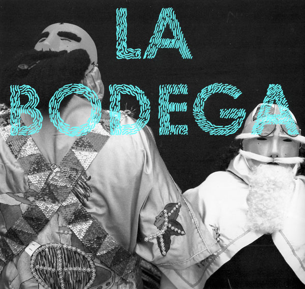
I have just recently finished this poster. It is type set in a three dimensional form spelling the words "jones town was my hometown" the letter forms are made up of little bones.


I made sketches for this poster over a year ago in my sketchbook and aproached this in the most difficult way of doing it.

I wanted a paraline drawing style so I roughed out the letters and then created a grid and layered it over with tracing paper. Then I created my own triangle and drew all these lines relating to the edges of the triangle. I know now that putting letters in perspective is something that can be done in several programs.


After that was done I then made a carbon copy from the tracing paper and transferred it to some cheep large butcher paper and inked it using various microns.

I inked it on and off for over a year, most of  the work was done this summer. When I came back to school this fall I was able to scan the whole thing at 400 dpi greyscale.


and then that file sat on my compter this whole fall semester. I wanted to silk screen it, blowing it up to 18"x24" but that never happened.

I was then informed of my school requesting submissions for artwork using words. A HA! I thought, now this is a perfect opportunity to finish this up. After a few setbacks, and time crunches I was unable to silkscreen it. I still wanted a color print so I ended up printing it digitally through my school.  The final dimensions are around 35"x40" with a bluish teal background and a deep magenta with a very dark blue line art.

I just dropped it off today and hopefully it will be on display this coming semester.

I still plan to silkscreen this sucker at that size, I just need to get a little bit more money to buy the supplies.

Tuesday, December 14, 2010

Sunday, December 12, 2010

Saturday, December 11, 2010

what I have been up to

This is my final for my course in drawing the graphic novel. A large 18x24 comic based on an obituary story. what you see here is my make shift light table I made by using this glass counter top of a wheely table and  a desk lamp underneath.

this is after several hours of lettering and inking.  I am using 3 types of microns a 03, 05, and 08 size.

almost finished, this was probably around 12-1 am in the morning, I was tired and I figured I could finnish the rest in the morning at school which I did.

This past week has been crazy, I spend most of my time in my room working on projects, both personal and for school.

What has gotten me through this week is my current addiction to watching breaking bad.


This is such a good show, chemistry high school teacher turns into drug dealer making meth with former student in a camper in the desert of new mexico. sounds like a show for me.  

lets hope my last week of school goes smoothly.

Q and F


recent letter forms for a abecedarium for a collaborative project. I will load the whole alphabet when I am done.

Friday, November 19, 2010

Watch Me

Page one of my mini comic based on the tortoise and the hare.  be on the look out of page two.

Details


Some specifics on my hot sauce label, The next phase is an Ad, I am still working out the little details on the image.


I was pretty excited today because the book I ordered off Amazon came in the mail today check it:


it's Taschen's Type a Visual History of Typeface and Graphic Styles

For this is pure eye candy, I love late century type, and these ornamental details that are just non existent today. Its a good, thick book that even comes with a code to download hi res scans of many of the contents in this book.

So that is all, back to writing a paper I really do not want to write.

Tuesday, October 26, 2010

Rabid Dog


I just finished designing and illustrating some artwork for a label I invented for my recent class assignment.

I chose a hot sauce label because I wanted to have some fun with the art work, I am also a far of hot things.

I spray painted this bottle a matte black, and had my label wrap around it, I think the black adds a great eye catching effect as well as framing the label.

Saturday, October 16, 2010

New projects


I have recently started a new painting, just to refresh my oil painting skills.  I made this image of a bomb character just walking along. 

I have also started a multiple page comic based on the Aesop's the tortoise and the hare. This time I am reinterinting it as a gym class situation. 

It seems that school is keeping me very busy, I am having trouble managing my time but I think it may just be this week.

Thursday, October 7, 2010

typographical work


Some stuff that I have done both past and present that show my interest in using more hand rendered  typography.

Monday, October 4, 2010

Franks wild years


A refined version of my editorial spread, I added copy in a snaking pattern to mimick a more distorted and non conventional direction like the song itself. I also changed the headline color for legibility purposes.

Sunday, September 26, 2010

Linework & my comic


Linework is an anthology of comics that features Columbia college students, I received one because my comic was featured in it! it is really good, and I must admit that the format it quite glorious. Just look at the size comparison of it to a sharpie, its cover is printed in tyvek which has an odd but interesting feel to it.


My comic White Waters on the left and a sweet comic entitled Wait! by Nick Drnaso on the right.

some sweet back cover action.

Currently I think the only way you can get this is through my schools shop, shopcolumbia. I recommend hunting one down because it is quite nice.

Tuesday, September 21, 2010

progress continued


Almost done with the color treatment, I originally started another one, but after talking this with my instructor I found that this was the most dramatic, and while it was hurting my eyes, I found that by adjusting the blues I could tone down the saturation and temperature. I really like it now.

and for those that have not figured it out yet the piece is based on the song franks wild years by Tom Waits  check out the song here:  Link

Saturday, September 18, 2010

Tuesday, September 14, 2010

progress

so I have recently finished the inked version of the illustration, my instructor liked it, and I have since started dropping in some color.


I really don't know how I feel about his treatment, color application I might try a new color version just to give me some sense of difference.

Saturday, September 11, 2010

working with a brush


This is just part of an inked spread for a class assignment. I chose to do this in brush, something I have been curious to try out. Using a #2 round brush I really like the look, much more smooth than the microns and pens that I would normally use.

This image is based on a Tom Waits song, if your familiar with the song you might figure it out on the details of the drawing.

I will be sure to get an actual scan of this and some color treatment some time soon.

Friday, September 10, 2010

Hidden Eggs

this is a small one page comic I did a while back, I was looking a lot of jim woodring at the time.

Tuesday, August 31, 2010

state of mind


something I have been working on and messing around with a bit.

Monday, August 30, 2010

Wednesday, August 25, 2010

white waters

This was a comic that I was in an exhibit in my school. It was really the first completed comic I have ever done.

I want to do more comics, and hopefully have a mini comic zine out at some point.

Tuesday, August 24, 2010

STICKERS


ok so my dad gave me this industrial roll of HIGHLIGHTER ORANGE stickers. It is much more saturated in person, but any way I decided it would be cool to make these into stickers

some linoleum and block ink and I have made these stickers. I have always been a fan of bold graphics and folkloric images and combing them into stickers was really fun.


Work in progress

I have decided that at this moment in my life I am more of an abstract painter. Which surprises me actually. I always wanted to aspire to be more of a realist, or illustrative painter only because of my strong background in illustration.

But after taking a painting course last semester, I found myself painting more abstract work so here is some recent progress.

acrylic on wood board, found images on the background.


so it is not done yet I will be sure to work on it some more and post my results.

Monday, August 23, 2010

This is the begining


My name is David and this is La Bodega.

My last blog was to document my process as an artist, but that failed.
It instead turned into journal of sorts with a platform to link to my mixes.

But this blog I want to keep focused on all things relating to art, design, and illustration. I want to show my process, progress and inspiration. I figured one could be the random journal, and the other the more focused blog on work.

so here it is.