Showing posts with label projects. Show all posts

Wednesday, August 10, 2011

work space/working


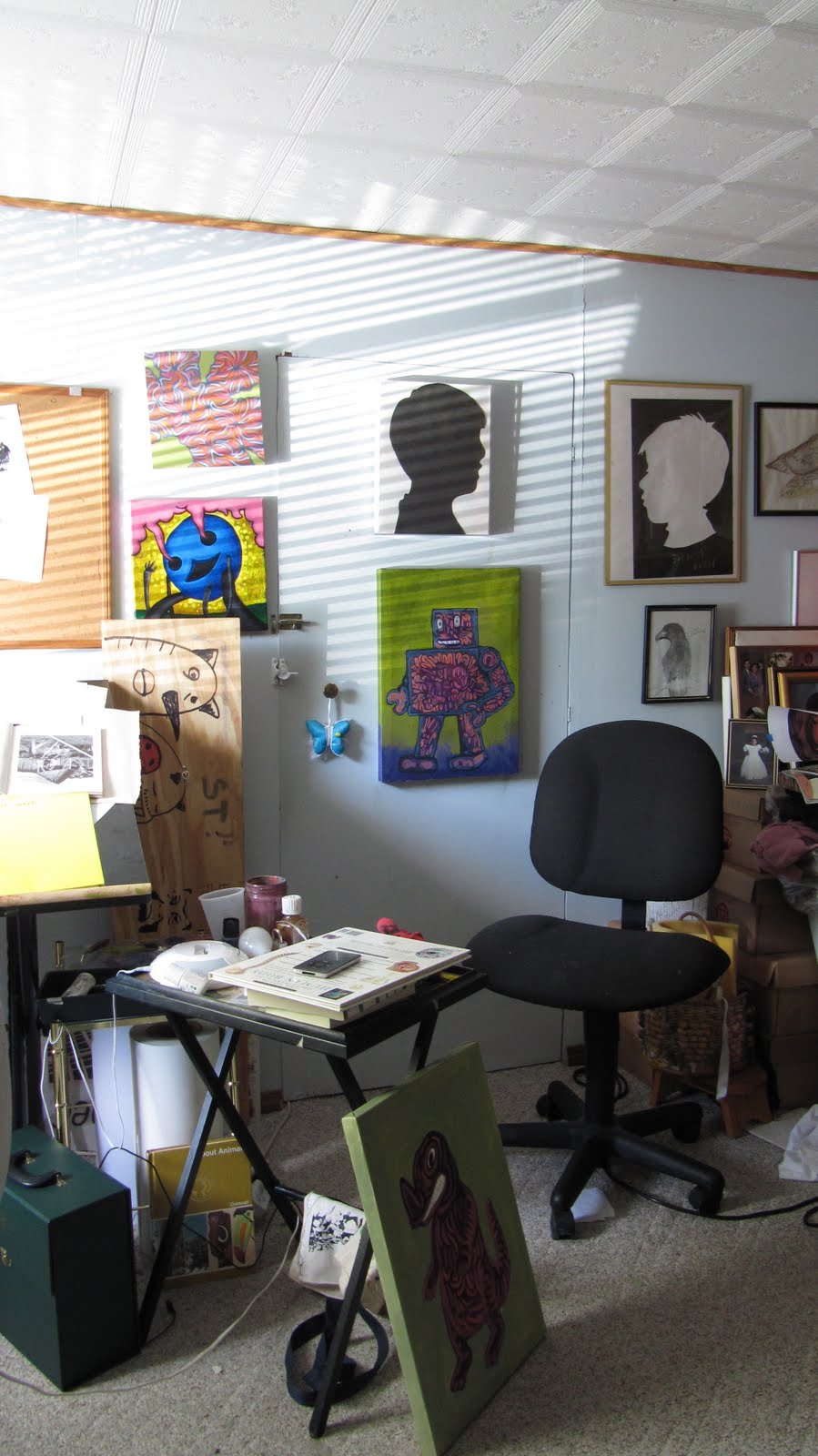
So I have spent a greater part of these few weeks painting. I took a mental break from drawing and really doing comics mostly because I was just exhausting myself. Instead I picked up painting, something that I did more of in the past and am sort of picking it up now again. The two paintings are still a work in progress.


Also I have a new work space! I got this spare room for myself which is nice because I finally have a comfortable setup for my drafting table.  The only downside is this is in a room that was once part of a garage so its design differently, it has carpeting and no heating or air conditioning. It sometimes gets really hot in there.


Friday, May 20, 2011

recent work


I made this for Echo magazine. It was an accompanying illustration about a short article on senses. 

Sunday, May 15, 2011

Final


So this was my final for my editorial illustration class. The project was illustrating your favorite place, I did deep sleep. 

Tuesday, May 3, 2011

more recent work


This piece here is my comic that I made for my final in my drawing the graphic novel class. It is an obituary story, I found this story from last year about a man who died from being gored by a mountain goat in the pacific northwest. 
This was also the comic that was included in the Hokin Honors Exhibit and it will be printed in Linework and anthology of comics from Columbia College students, alumni faculty and staff. I have seen the proofs and it looks really good.Be on the look out for that soon.

Thursday, April 21, 2011

Recent work.


So This is a set of illustration that I did as part of my editorial illustration class. 
The concept was to attend an event that we have never been to, document and illustrate it in a illustrated essay. 

For my event I went to an Asian market close to where I lived. 
This was challenging, and I am surprised to see where they ended up as a set. Because they looked radically different from my initial sketches.  Overall I am more or less satisfied with the end concept.

Friday, March 11, 2011

lunch time title

Just the colors no line art, lunch time is something that I have been making at for a while more on it later.

Saturday, March 5, 2011

Jacks Big Score


Two page comic that I recently made. Jack is a actually a combination of two people that I used to work with, I always wondered what their life was like outside of work and well the result is this.

Saturday, February 19, 2011

things


I have been reading some stuff from tezuka lately, he stuff is pretty awesome. The page above is from dororo story about a man born incomplete, missing parts of his body and and his journey to get them all back. 

So I also had to design a logo for a 7-10 second animated spot in my broadcast design class. This is it right here. I think the large pomp sums up what I am all about right now. 

Monday, January 3, 2011

He bites


This is my ad that I did for the product assignment. I am still unsure of the copy and it might change if I run this through a few people. 

I used illustrator for the whole ad, which was a first for me. Illustrator is something that is still a challenge but I like the clean lines and solid colors of Illustrator. 

I liked this assignment a lot and I am actually in the process of sketching another product label.

Sunday, December 19, 2010

working on watch me


This past semester I made a small mini comic called watch me. I have posted pages from that on this blog so far, and I will post all of it eventually. But after finishing it I did not like the cover so much. I gave it to a few people and there are some mistakes. So I plan to reprint it, adding 4 more pages, one more single page comic, title page and maybe some endpapers? not sure at this point about the end papers.


what I am sure of though is the cover. The current cover was made half assed just to get something done on time for the class. I like things to make some sort of sense, and the text reads as if this comic was about melting meat parts, or some zombie trippy horror story. Watch Me is in fact about a high school gym class, drawing refrence to the tortoise and the hare. 

so I decided to make a long spread that will extend from back to the front cover. I think this is the best change I can make to this comic, making something more consistent with the actual story.

be on the look out for a much more finished and presentable copy.

Friday, December 17, 2010

Completed


I have just recently finished this poster. It is type set in a three dimensional form spelling the words "jones town was my hometown" the letter forms are made up of little bones.


I made sketches for this poster over a year ago in my sketchbook and aproached this in the most difficult way of doing it.

I wanted a paraline drawing style so I roughed out the letters and then created a grid and layered it over with tracing paper. Then I created my own triangle and drew all these lines relating to the edges of the triangle. I know now that putting letters in perspective is something that can be done in several programs.


After that was done I then made a carbon copy from the tracing paper and transferred it to some cheep large butcher paper and inked it using various microns.

I inked it on and off for over a year, most of  the work was done this summer. When I came back to school this fall I was able to scan the whole thing at 400 dpi greyscale.


and then that file sat on my compter this whole fall semester. I wanted to silk screen it, blowing it up to 18"x24" but that never happened.

I was then informed of my school requesting submissions for artwork using words. A HA! I thought, now this is a perfect opportunity to finish this up. After a few setbacks, and time crunches I was unable to silkscreen it. I still wanted a color print so I ended up printing it digitally through my school.  The final dimensions are around 35"x40" with a bluish teal background and a deep magenta with a very dark blue line art.

I just dropped it off today and hopefully it will be on display this coming semester.

I still plan to silkscreen this sucker at that size, I just need to get a little bit more money to buy the supplies.

Saturday, December 11, 2010

what I have been up to

This is my final for my course in drawing the graphic novel. A large 18x24 comic based on an obituary story. what you see here is my make shift light table I made by using this glass counter top of a wheely table and  a desk lamp underneath.

this is after several hours of lettering and inking.  I am using 3 types of microns a 03, 05, and 08 size.

almost finished, this was probably around 12-1 am in the morning, I was tired and I figured I could finnish the rest in the morning at school which I did.

This past week has been crazy, I spend most of my time in my room working on projects, both personal and for school.

What has gotten me through this week is my current addiction to watching breaking bad.


This is such a good show, chemistry high school teacher turns into drug dealer making meth with former student in a camper in the desert of new mexico. sounds like a show for me.  

lets hope my last week of school goes smoothly.

Q and F


recent letter forms for a abecedarium for a collaborative project. I will load the whole alphabet when I am done.

Friday, November 19, 2010

Details


Some specifics on my hot sauce label, The next phase is an Ad, I am still working out the little details on the image.


I was pretty excited today because the book I ordered off Amazon came in the mail today check it:


it's Taschen's Type a Visual History of Typeface and Graphic Styles

For this is pure eye candy, I love late century type, and these ornamental details that are just non existent today. Its a good, thick book that even comes with a code to download hi res scans of many of the contents in this book.

So that is all, back to writing a paper I really do not want to write.

Tuesday, October 26, 2010

Rabid Dog


I just finished designing and illustrating some artwork for a label I invented for my recent class assignment.

I chose a hot sauce label because I wanted to have some fun with the art work, I am also a far of hot things.

I spray painted this bottle a matte black, and had my label wrap around it, I think the black adds a great eye catching effect as well as framing the label.